Learning more about photoreal texturing and also learning a thing or two about Arnold. And here is the product of some of that learning... a WIP beauty render of something I'm not terribly ashamed of :) As always I have much to learn and far to go but making progress feels good.
Beth Daigle
Doodles, photography, portfolio works in progress and more.
Thursday, October 2, 2014
Wednesday, October 1, 2014
First Zbrush Charcter Model
I call her "Lady Agnes"
My idea was to create an elderly yet very dignified high society woman from the Edwardian era.
My idea was to create an elderly yet very dignified high society woman from the Edwardian era.
Digital Fine Art: Project 2
Project 2: Work with a group to create an installation piece that will be projected onto a building.
Artist Statement:
The idea that everyone in the class agreed upon was for each of us to create a room in an art style we identify with and to project each of our rooms in chronological order of our art movements (or the possible time setting of the scene in some cases), onto the wall of SCAD's Montgomery Hall. I chose to create an Art Nouveau/Deco style room. I say both Nouveau and Deco because I imagine this room as one that might exist in an inbetween time, say 1915 or so, when both Nouveau and Deco had a certain degree of influence. I chose this because those are styles I thouroughly enjoy, especially Nouveau as I am a big admirer of the work of Alphonse Mucha. In my room I seek to create a sense of beauty, luxury, and comfort in a turn of the century drawing room.
Previsualization
Here are some of the many reference images I gathered online to study before beginning my project:
Process:
One of the requirements for the project was to also create meanigful transitions for each of our scenes. For the transition into my scene I chose to create a curtain that would open to reveal my room. This is where I started before I had fully put together my room. I was able to animate my curtain quite quickly and easily with nCloth by following a tutorial on youtube.
For the texture for my curtain I actually created a separate Maya scene in which I built a small scene that I would render and then texture my curtain with that rendered image. I wanted to create an image that would feel somewhat reminiscent of Mucha's posters with a touch of Deco. To do this I found a simple head mesh online and altered the geometry slightly in Maya to create a subtle expression. I then painted a stylized texture for the female model that looked a bit flat and posterized. For the hair I used Maya's paint effects, but instead of using paint effects hair, I used paint effects swirly trees because I liked the effect better. For the background of my curtain I simply stylized Maya's procedural cloth texture to create a pattern. Here is the final look of the curtain:
Once I was finished with my cloth transition I began working more on my room. To speed along the process for this project we were allowed to use found models, so I took advantage of that and browsed several sites to carefully pick out furnishings for my room. I had a rough color pallette in mind and colored my models with lamberts in those colors as I began to put together my scene. Here is an early test render.
Initially I had my room lit pretty dimly, however that ended up not working because I lost a lot of detail when projected onto the building, which
Here is the final version of my room with all lights and textures in place. I chose to animate the fire to keep some movement in my room by cycling through four frames of flame animation to keep the time spent rendering low.
Once I had the room the way I wanted it to be I needed to find a way for it to transition into the next room which would begin with a blue sky (the same blue sky that's behind my windows). I chose to go about this by bringing large amounts of blue light through the window and making it look as if it was leaking into the room and taking over in a really beautiful magical looking way. I went about this using Nuke,
Final Animation with Transitions
Digital Fine Art: Project 1
Project 1
Project Requirements
The
main goal of Project one is quite open ended. I must create a work of
art that could be (and hopefully will be!) displayed in an art gallery.
Every stage of this project must be created entirely with digital means
up until a physical copy is printed.
Concepts
I must admit, when a
project is so open ended it can be very easy to get lost in all of the
artistic freedom you are given. Because of this I forced myself to make
as many definite decsions early on as I possibly could. Here are some
things I decided upon before even beginning concept work.
-
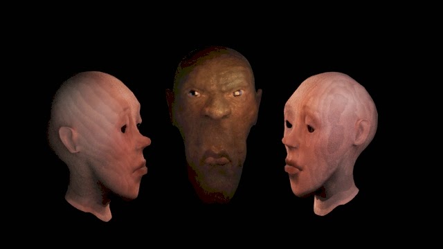
I am enamoured with the idea of doing a triptych with each part being a long thing rectangle shape. So this will be the setup of my project with the center piece being brighter and drawing support from the two outer pieces.
-
My digital medium will be 3d. As always I want to put focus on lighting and shading in 3d but this time I am excited for the oppurtunity to be a bit more abstract and use more self expression.
-
I will use a very dark background and soft vignetting to draw the eye in a way that I find sophisticated in art.
-
I will keep my subject matter challenging yet do-able. I will be modelling everything entirely myself and because of that I don't want to get bogged down in too-complicated models.
Rough Concept Sketch
The
concept I chose to move forward with is a triptych consisting of three
(really just two) faces. The center face is that of an old woman and is
lit warmly and intensely while the outer faces are two sides of the same
younger feminine face that are dimmer
than the center face. The faces are very stretched in a totem like way that brings about a sense of a tribal ritual.
Artist Statement:
The idea for this piece is
to evoke a confrontational sense a cult-like mystery. The center figure
represents a concentrated face of learned wisdom and even begins to
evoke a sense of fear in the viewer. The outer faces are those of quite
listeners. They represent curiousity, inmocence and youth. They are the
faces of the students beginning to absorb knowledge from the mysterious
exalted master. This piece displays a relationship between the face of
blank slate young potential and the face of seemingly all-powerful
accomplished expertise and examines the state of mind involved in
learning in a quite ceremonial place within the mind.
Previsualization
Process
At this stage I was trying out a degree of realism especially with the center face. I was sorting out my basic lighting and had not yet given much attention to the side faces.
Here I am continuing to work with lighting and deciding how I feel about the integration of the wood texture.
I wanted to see if I could do something to artistically break up the outer edges of the faces. I messed around with displacements and ended up adding a render layer with a displacement much like the one on the right that I would later composite on top of the beauty render in photoshop.
Finally as opposed to adding hair to the figures, which I felt would be visually detracting, I decided to add a few vines clinging to each of their faces. The right face is meant to be feminine so I added light delicate vines falling down from where hair might have been. For the male on the left I added dark, less flowery vines clinging to where a beard might be.
Final
Saturday, October 19, 2013
Wednesday, September 4, 2013
Sunday, August 18, 2013
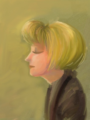
Quick Sketch of Screenshot from The Black Stallion
Just Trying to get the gist of it.
Also, by quick I mean somewhere in the area of 2 hours. I know this doesn't look like a two hour painting but hey, we've all gotta start somewhere.
Subscribe to:
Comments (Atom)


